Water Sort Puz - Color Game
- 4.8
- Rating
- 10.00M
- Installs
- Free
- Price

 Analysis by App-foxy
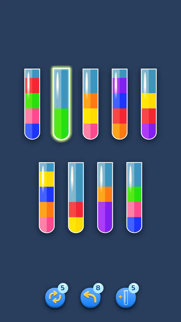
I approached Water Sort Puz - Color Game as the kind of puzzle I could pick up for a few quiet minutes and put down without losing my place. The idea is familiar: colored liquid is arranged in bottles, and I move it between containers until each bottle holds a single color. That simple action gives the game an immediately understandable goal, while the changing arrangements gradually demand more planning than the cheerful presentation first suggests.
It is a free puzzle game from Bluetile, aimed at Everyone, and it runs on Android devices using version 7.0 or later. The current version is 3.5.3. I think those details matter because this is not a specialist brain-training tool or a story-driven adventure; it is a straightforward color-sorting experience designed to fit into ordinary gaps in the day. Its store summary presents it as a relaxing way to train the brain, and that balance between calm repetition and careful decision-making is a fair description of how it feels in use.
The game has attracted a large audience, with an average rating of 4.8 from around 607 thousand ratings and more than 10 million installs. Those figures suggest that the format is easy for many people to understand, although popularity alone does not make every design choice suitable for every player. My main interest here is how comfortably the game communicates its puzzles, how much physical precision it asks for, and whether it remains usable in less-than-perfect situations such as a noisy commute or a short break at work.
You May Also Like

 Blood Strike: 2.5 Anniversary
Blood Strike’s Loadouts Turn Every Drop Into a Tactical Gamble
A close look at Blood Strike’s custom loadouts: how fast access to signature weapons reshapes its battle royale rhythm, rewards preparation, and narrows the gap between fights.

 Pandora - Music & Podcasts
Pandora’s Music Is Easy to Start, but Harder to Recover
Pandora’s strength is its low-effort path from a seed to a station. Its weak spot is how much confidence it asks you to place in connection, setup, and quiet recovery.

 8 Ball Pool
 Is Built on Rivalries, Rematches, and Routine
A close look at the rivalries, rematches, shared routines, and unanswered safety questions that turn a quick pool match into a persistent mobile community.

 Samsung Music
’s Quiet Strength Is Playing What You Already Own
Its reach comes less from spectacle than from dependable access to a personal library. That simplicity is both the app’s strongest retention engine and its ceiling.

 AccuWeather: Weather Radar
AccuWeather Review: A Quick, Clear Forecast for Everyday Decisions
For everyday plans, the best forecast is the one you can understand quickly. AccuWeather makes rain timing, radar, and local conditions easy to act on, with a few trade-offs.

 Hill Climb Racing
Why Hill Climb Racing Still Turns Crashes Into One More Run
A tiny car, a bumpy hill and one more upgrade: Hill Climb Racing keeps resurfacing because its simple chaos makes every near-miss feel personal.
More From Our News Desk



How the puzzle communicates with you
I find the game’s visual layout does most of the explaining: the bottles show what is available, while each transfer makes the result easy to inspect. In this section, I focus on how that clear feedback helps me decide whether a move was useful, and why it can make the puzzle approachable without making every level effortless.
Readable layouts and a gentle learning curve
The strongest part of the experience is its visual clarity. Bottles provide obvious boundaries, and the colored layers make the state of a puzzle visible at a glance. I never needed a long explanation to understand what I was meant to do. Selecting a bottle and choosing another creates a direct relationship between the action and its result, which is helpful for players who prefer learning by trying rather than reading instructions.
That simplicity also benefits people who are new to mobile puzzles. There is no complicated control scheme to memorize, and the central task stays consistent from one challenge to the next. A player can begin by looking for an easy transfer, then slowly recognize that an apparently useful move may block a color needed later. This gives the game a natural teaching rhythm: the interface stays familiar while the thinking becomes more demanding.
I found the bottle arrangement more useful than a busy puzzle board would have been. The open spaces and separated containers make it easier to follow where a color is going, especially when I pause before making a move. That pause is important for anyone who processes visual information more slowly. Rather than forcing quick reactions, the format rewards looking, comparing, and deciding.
There is also a practical advantage in being able to understand a position without relying on written language. The core information is carried by the bottle contents and the available spaces, so a person who is not comfortable reading English can still grasp the basic objective. This does not make the entire experience language-free, since menus and surrounding interface elements may still require reading, but the puzzle itself is unusually easy to interpret through its visual arrangement.
Where visual clarity can become less reliable
Color is also the game’s main weakness from an accessibility perspective. The puzzle depends on distinguishing one liquid shade from another, and that can be difficult for players with color-vision differences, reduced contrast sensitivity, or a screen affected by glare. The bottles may be visually separated, but the identity of each color remains central to solving the level. If two shades look similar on a particular display, the challenge can shift from logical planning to guessing.
I would therefore recommend testing the game on the device that will actually be used, rather than assuming that a clear screenshot represents every screen. Bright outdoor light, a dim display, or a phone with unusual color settings can all reduce separation between layers. Increasing screen brightness may help temporarily, but it can also make long sessions less comfortable and does not solve every color-identification problem.
The game is most comfortable when I can inspect the whole arrangement without rushing. A small phone can still show the necessary information, but the bottles and liquid bands naturally have less room than they would on a larger display. Someone with low vision may need to hold the device closer or use system-level magnification, and that can make repeated transfers less convenient. The game’s basic design is clean, yet clean does not automatically mean equally readable for every person.
One useful habit is to name the colors mentally by position as well as appearance. For example, I might think of a bottle as “the upper-left warm shade” instead of relying only on a color label. This does not replace proper visual differentiation, but it reduces the chance of confusing two nearby bottles while planning. It is a small strategy that helps when the board is crowded or when I am playing in uneven lighting.
Navigation that stays out of the way
Navigation is uncomplicated, which suits the game’s short-session nature. I can move from the puzzle to other parts of the experience without having to learn a complicated hierarchy. That matters for players who find dense menus tiring or who want to return to the current challenge quickly after an interruption.
The basic interaction is also forgiving in the sense that the player has time to consider a move. This is not a reflex game that punishes a slower response with an immediate failure. For me, that makes it more approachable when I am tired, distracted, or using only one hand. The mental workload comes from sequencing the colors, not from racing a clock or reacting to rapidly changing objects.
Still, simple navigation can feel limited if you expect extensive customization. Players who want a broad set of display controls, alternative symbols, or a highly configurable interface may find the experience more basic than dedicated accessibility-focused software. I would not choose it specifically for interface personalization. I would choose it because the central board is easy to understand and the route back to play is relatively direct.
Physical control, sensory comfort, and everyday situations
I look at the physical side of play as well as the screen: choosing a bottle is simple, but doing it comfortably depends on steadiness, lighting, and where I am. The next section considers how I would adapt a session for a commute or a quiet break, and when the need to look and tap carefully makes another activity a better fit.
How much precision the transfers require
The bottle-to-bottle action is conceptually easy, but it still asks the player to touch the correct areas on a small screen. This creates a different kind of barrier from the visual one. People with tremors, limited finger control, joint pain, or difficulty maintaining a steady tap may occasionally select the wrong bottle. The game is not built around rapid swipes or complex combinations, which helps, but repeated tapping can still be tiring during longer sessions.
I prefer playing with the phone supported in one hand or resting on a surface, especially when I am trying to solve a difficult arrangement. That reduces accidental movement and makes it easier to tap deliberately. Someone using a stylus may also find the bottle targets easier to address, although the experience is still fundamentally designed around a touchscreen. A larger device can improve target separation, while a very compact phone may demand more accuracy than expected.
The absence of a speed requirement is a meaningful advantage. A player who needs extra time to position a finger is not automatically placed at a disadvantage compared with someone who can tap quickly. The puzzle’s pressure is strategic rather than physical. In my experience, that makes it more accommodating than action-oriented mobile games, even though it does not remove the need for accurate touch input.
There is a trade-off here: the more carefully I play, the more comfortable the controls become, but that also makes each level take longer. If I am using the game as a brief break, this is fine. If I am looking for fast, effortless entertainment while walking or carrying something, it is a poor match. I need at least enough attention to see the board and tap the intended containers safely.
Sound, focus, and sensory load
The visual board is the main source of information, so the game can suit someone who prefers a quiet, self-contained activity rather than a screen filled with animation. I can concentrate on the current arrangement instead of tracking characters, maps, or multiple moving elements. That restrained structure is one reason I find it calming.
At the same time, “relaxing” depends on the player and the level. A nearly solved board can become surprisingly tense when one spare bottle has been used badly. The frustration is not caused by fast action; it comes from realizing that an earlier decision has narrowed the remaining options. Players who want an entirely passive experience should know that the game gradually asks for genuine concentration.
For sensory comfort, I would use it in short sessions and adjust the device rather than treating the game as something to play continuously. The repeated pattern of bottles and color bands is easy to follow, but extended staring at a bright screen can still be fatiguing. People sensitive to visual repetition may enjoy the simple layout at first and then want a break once several puzzles begin to look alike.
Why it works well in ordinary routines
A realistic use case is a short wait at a clinic, a quiet bus ride, or a few minutes between household tasks. I can open the game, examine one board, make a handful of planned transfers, and stop when my attention is needed elsewhere. The bottle arrangement is self-contained, so I do not need to remember a story or reconstruct a large world after an interruption.
That makes it a good companion for people who want a mental reset without committing to a long session. It can also work for someone who enjoys sorting and organizing activities but wants a digital version that adds a layer of planning. The satisfaction comes from turning a messy arrangement into clearly separated bottles, which gives each completed puzzle a neat visual conclusion.
However, I would avoid playing while walking, crossing streets, or handling anything that requires full attention. The game may be slow-paced, but it still needs visual focus and deliberate touch. It is also not ideal when the phone is likely to be interrupted every few seconds, because frequent distractions can make it harder to remember which bottle was being used as temporary storage.
For travel, the free entry price is convenient, but the experience may not be equally comfortable in every environment. On a moving vehicle, screen glare and vibration can make precise taps harder. In a quiet room with stable lighting, the same puzzle feels much more accessible. The game fits flexible routines best when the player can choose a stable position and give the board a little uninterrupted attention.
What the game asks from different players
Different players bring different strengths to a color-sorting puzzle, so I consider who benefits from its unhurried, visual reasoning and who may run into friction. I also explain the practical trade-off between learning through bottle patterns and relying on color distinction, so readers can judge whether this particular style suits them.
Useful strategies for reducing friction
The most valuable technique I found is to treat empty bottles as working space rather than as an invitation to make the first available move. Before transferring anything, I look for colors that are already stacked together and protect them from unnecessary disturbance. This keeps the board readable and reduces the number of times I need to undo a poor plan mentally.
I also try to expose a buried color only when I know where it can go next. Moving a top layer may feel productive, but it can leave a bottle in a less useful state if the newly revealed color has no matching destination. Thinking one transfer ahead is often enough for early puzzles; later arrangements reward thinking several steps ahead without requiring fast hands.
Another practical approach is to pause after every important transfer and rescan the entire board. Players with attention difficulties may find it easier to use a fixed scan order, such as checking bottles from left to right and then reviewing the empty spaces. That prevents the eye from jumping randomly between similar colors and makes it less likely that a useful move will be overlooked.
These strategies reveal a strength that is easy to miss in a short store description: the game can be adjusted mentally to different processing speeds. I can play intuitively when the board is simple, or use a deliberate written or verbal plan when the arrangement becomes difficult. The app does not need to become faster to remain engaging; the player can change the depth of analysis instead.
Who may find it a strong fit
I think the game suits people who enjoy visual order, small logical problems, and a clear beginning and end to each challenge. It is especially approachable for someone who dislikes complex controls but still wants more substance than a purely passive time-killer. The Everyone age rating also makes the concept broadly approachable, although individual comfort with color-based play will vary.
It may be a useful choice for older players who prefer a calm pace and a visible goal, provided the screen offers enough contrast and the touch targets are comfortable. It can also suit people who want a low-commitment puzzle during breaks, because there is no need to learn a large ruleset before getting started.
I would be more cautious recommending it to someone who needs strong nonvisual cues, has difficulty distinguishing colors, or relies on extensive control customization. The central mechanic leaves little room to bypass color recognition. Likewise, players seeking competitive rankings, a rich narrative, or constantly changing puzzle types may find the bottle-sorting format repetitive rather than relaxing.
Free access and the question of spending
The game is free to download, which makes trying it low-risk. It does include in-app purchases ranging from $0.99 to $21.99 per item. I would approach those purchases as optional conveniences rather than part of the reason to install the game. Anyone who is sensitive to spending prompts should check the device’s purchase controls before handing the phone to a child or another family member.
The free starting point is particularly useful for deciding whether the color-based presentation works for your eyes and whether the touch interaction feels manageable. I would not spend first and evaluate later. A few sessions are enough to discover whether the repeated sorting loop feels satisfying or whether it begins to feel like the same task wearing different arrangements.
Where it stands beside other puzzle choices
Compared with match-three games, this one is less dependent on quick pattern recognition and chain reactions. I have more time to plan, and the board changes because of my decisions rather than because pieces continuously fall into place. That makes it better for deliberate thinking, but less exciting for someone who enjoys bursts of animation and immediate rewards.
Compared with Sudoku, the reasoning is more visual and spatial. I do not need to work with a grid of written numbers, which may feel more approachable for some players. On the other hand, Sudoku offers a clearer symbol system for people who find colors unreliable. If color distinction is a concern, a number-based logic puzzle may be the safer alternative.
Compared with word puzzles, Water Sort Puz avoids vocabulary and spelling, which can make it easier to start across language backgrounds. The trade-off is that it offers less variety in the kind of knowledge or language practice involved. It is a focused sorting challenge, not a broad mental workout covering several skills.
Compared with fast arcade games, the bottle format is much more tolerant of pauses and slower reactions. I can stop to think without feeling that the whole board is moving away from me. Yet it is not the best alternative for someone who wants physical energy, social competition, or a strong sense of progression through a story. Its appeal is narrow, but within that lane it is coherent.
My inclusive verdict after using it
The best reason to try this game is its calm, visually direct logic. The bottle arrangement makes the objective understandable, the pace gives players room to think, and the short-session format fits real life better than many puzzle games that demand continuous attention. Bluetile has kept the central interaction uncomplicated, which helps players who want to begin playing rather than study a manual.
Its inclusive strengths are real but limited. A slower player is not punished by reflex-heavy action, and the puzzle can be approached through observation and planning. The main barriers are equally clear: color recognition is essential, small-screen tapping may challenge some users, and the repeated visual format offers little flexibility for people who need alternative ways to identify objects.
I would recommend it to a friend who likes sorting, quiet concentration, and puzzles that can be completed in manageable pieces. I would suggest trying it on the intended device under normal lighting before deciding whether it is comfortable for regular use. I would also recommend keeping sessions short if screen fatigue or repetitive visuals are a concern.
My final view is positive, with a specific qualification: this is a good accessible-feeling puzzle for pace and simplicity, but not a universally accessible puzzle. It earns its 4.8 average from around 607 thousand ratings because the basic idea is immediately inviting and easy to revisit. Still, people who need strong color alternatives, extensive customization, or more varied gameplay should choose another type of puzzle. For everyone else, the free version offers a pleasant way to turn a few spare minutes into a small exercise in planning.
FAQs for Water Sort Puz - Color Game
01What is Water Sort Puz - Color Game?
Water Sort Puz - Color Game is a fun and addictive puzzle game available for both Android and iOS devices. The main objective is to sort colored liquids into their respective bottles until each bottle contains a single color. It's an engaging way to test your problem-solving skills while enjoying visually soothing gameplay.
02How do you play Water Sort Puz - Color Game?
In Water Sort Puz - Color Game, players tap on bottles to pour colored water from one bottle to another. The rule is that you can only pour water into a bottle if it has enough space and the top color matches. Strategically plan your moves to complete each level with fewer steps to earn higher rewards.
03Is Water Sort Puz - Color Game free to play?
Yes, Water Sort Puz - Color Game is free to download and play. However, it does offer in-app purchases for players who want to enhance their gaming experience. These purchases might include hints, ad removals, or additional game features, but they are not necessary to enjoy the core gameplay.
04Are there any ads in Water Sort Puz - Color Game?
Water Sort Puz - Color Game does contain ads, which help support the developers and keep the game free to play. Ads typically appear between levels or upon restarting a level. Players can choose to make an in-app purchase to remove ads if they prefer an uninterrupted gaming experience.
05What are the key features of Water Sort Puz - Color Game?
The key features of Water Sort Puz - Color Game include its intuitive and relaxing gameplay, vibrant graphics, and a wide variety of challenging levels. The game also provides hints to assist players when they get stuck, making it suitable for all ages. It’s a great way to unwind while sharpening your cognitive skills.
Pros
- Visually appealing and calming interface.
- Simple mechanics
- easy to learn.
- Offline play available.
- Challenging puzzles to keep you engaged.
- No intrusive ads during gameplay.
Cons
- Levels can become repetitive over time.
- Ads between levels can be distracting.
- Limited hints can be frustrating.
- No multiplayer or social features.
- In-app purchases can be pricey.

Water Sort Puz - Color Game
Gallery